Internal channel for sensitive reports
McDonald’s
Projetar um canal de denúncias não é um problema de interface. É um problema de confiança.
Este mini-case documenta o redesenho de um canal interno usado por colaboradores do McDonald’s para envio de relatos éticos e denúncias. A decisão central foi tratar o formulário como parte da infraestrutura institucional, responsável por reduzir medo, ambiguidade e abandono em um contexto corporativo de grande escala.

The project
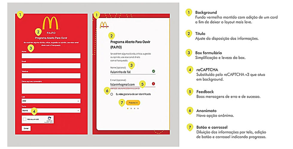
The work began with an existing form.
The barrier was not in the fields themselves, but in how employees perceived the channel. Fear of exposure, uncertainty about anonymity, and distrust regarding the handling of information prevented its use.
The decision was to treat design as an active element in building trust. The interface needed to make it clear from the first interaction that the channel was secure, serious and predictable.
The challenge
Each design decision directly influenced the choice between proceeding or abandoning.
At stake were
-
perceived anonymit
-
risk of exposure
-
clarity about what happens after submission
There was a mismatch between institutional intent and the perceived experience. This friction undermined the channel’s credibility and put the entire system at risk.

Product decisions
Empathy was not treated as emotional language, but as a structural criteria.
The flow was designed around objective questions:
-
Does the person feel safe before writing
-
Is the destination of the information clear?
-
Is anonymity understood as guaranteed?
The key decisions were:
-
Explicit anonymity from the start of the flow
-
Reducing the form to the minimum necessary
-
Direct language, without legalistic or punitive tone
-
Predictable feedback, without surprise or threat
The goal was not to encourage reports, but to remove the barriers that prevented use.
Processo
Prototyping followed McDonald’s brand guidelines rigorously to preserve institutional consistency.
The work began with mapping usage risks and proceeded with navigable prototypes in Adobe XD, validated with a focus on comprehension and predictability.
Attention-grabbing visual elements, metaphors, and any form of gamification were discarded. The interface needed to convey seriousness, not engagement.
Design role
I acted as Product Designer responsible for translating human risks into concrete product decisions.
The work balanced brand guidelines, institutional responsibilities, and actual usage insights. The outcome was not a more visually appealing form, but a functional listening channel in a sensitive context.
Results
Detailed metrics are not public.
Even so, changes in perception were evident. The channel’s operation became better understood, friction decreased, and trust increased. The form was no longer seen as an obligation but recognised as a legitimate means for reporting.
Learnings
-
Empathy only works when it guides decision-making, not rhetoric.
-
Anonymity must be perceived as real before any technical validation.
-
Clarity about the process reduces fear more than any visual protective layer.
Projects like this demonstrate that product design also assumes social responsibility by creating safe conditions for action.
Closure
This project demonstrates how Product Design operates in critical human contexts.
Before any interface, some systems need to ensure that people can act without fear.


